This article is more than three years old. Take a look at our current courses and programs!
New year, new address, new identity
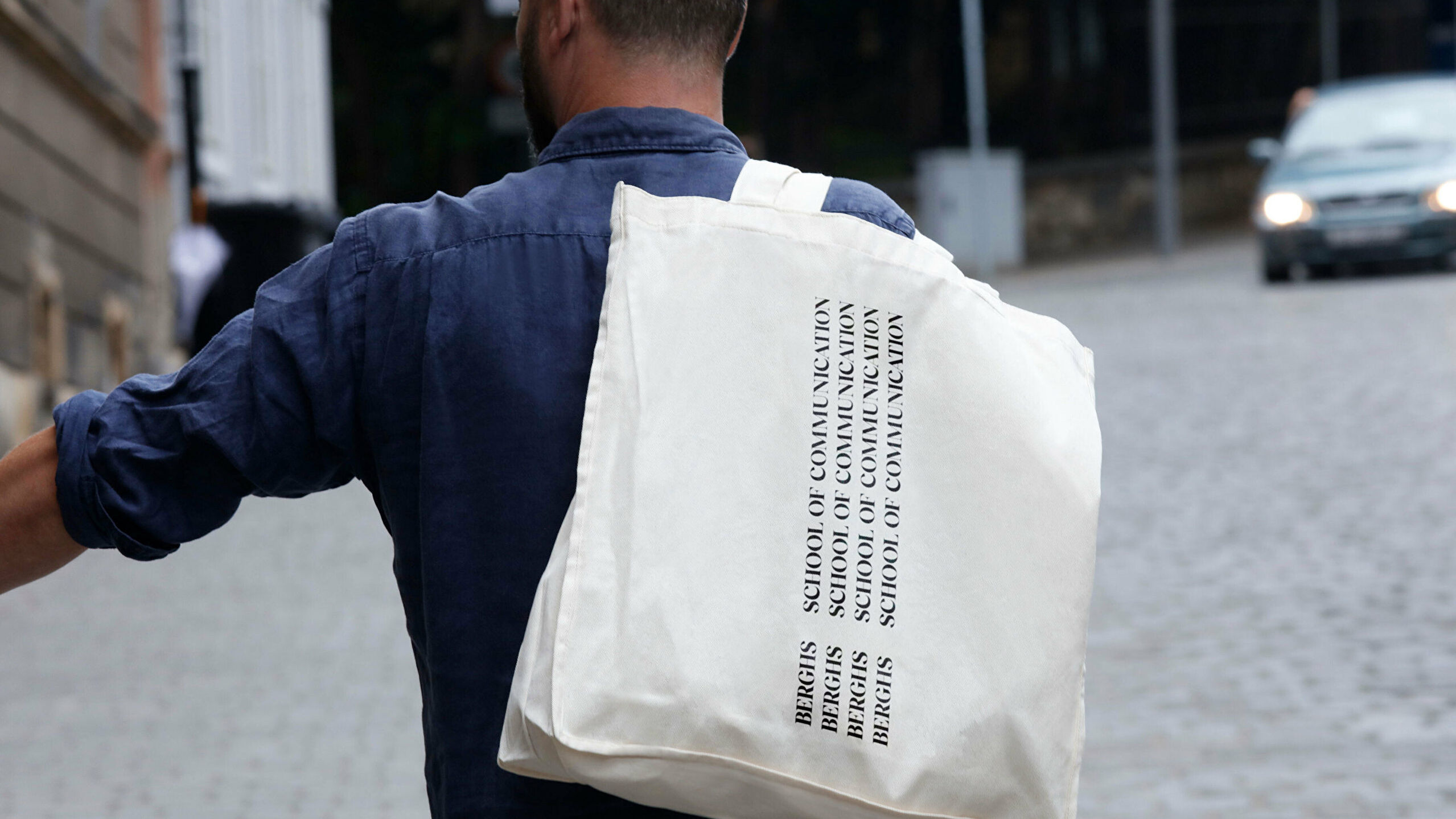
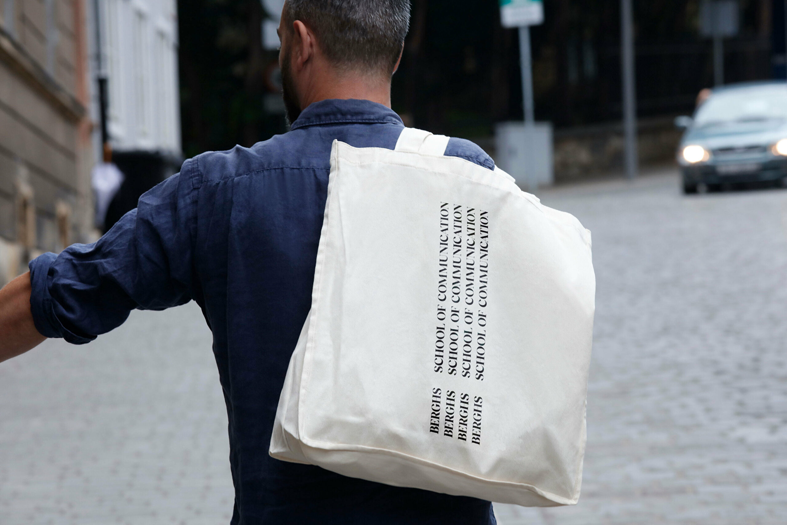
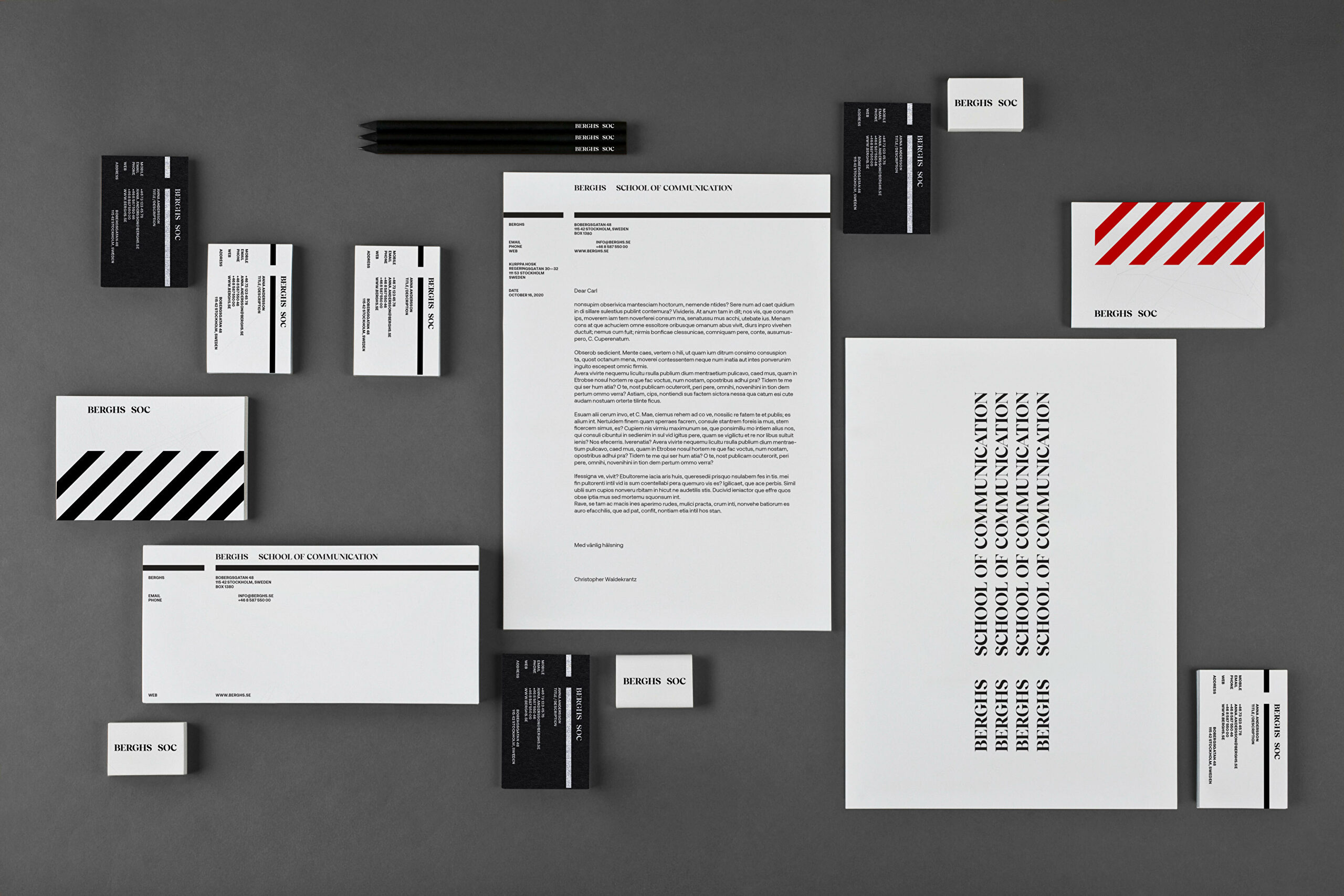
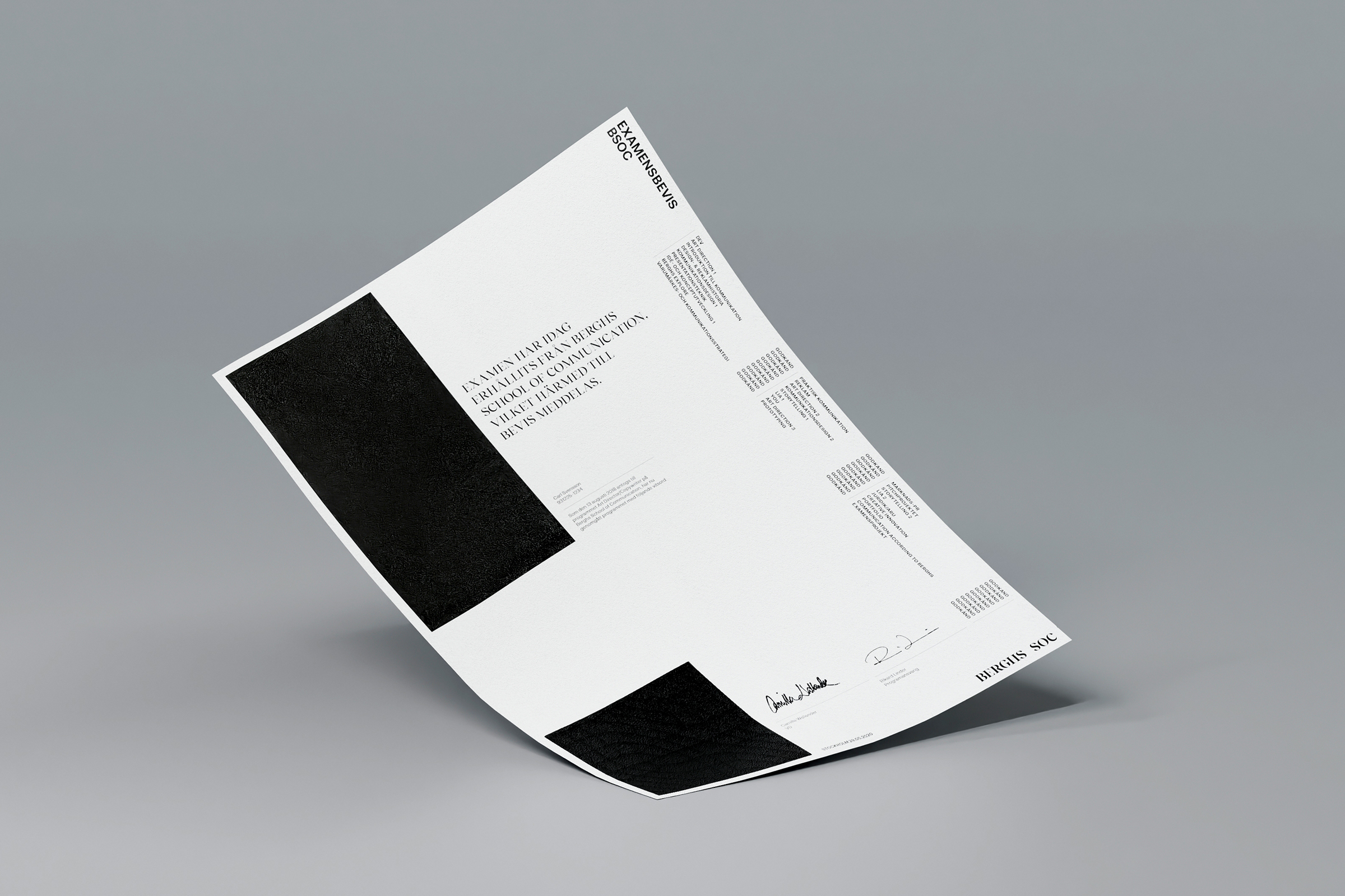
In spring 2020, a collaboration to modernise the Berghs brand began with the design agency Kurppa Hosk. The brief was to balance the school's history to modernise and better reflect the contemporary communication landscape. We're pleased to say that our new identity is now ready.
Last spring, Berghs invited local design agencies to pitch on updating our visual identity, designed in the late 1990’s by advertising and design legend Lars Hall. The new identity was developed to give Berghs a strengthened professional and international profile. It focuses on communication and places less emphasis on advertising and design alone, and works better in digital contexts.
- During the pitch, we looked for a partner who could work with our heritage and reinvigorate our visual language. We also needed a team that we could work intuitively with. We chose Kurppa Hosk because their pitch presentation best aligned with our ambitions and ideas about what Berghs should look and feel like. They have handled this balance in a nuanced and expert way.
- The new identity is more edgy and modern but also remains true to our visual heritage. The concept was built on the idea of "the space in-between". Exploring the space from which communication leaves the sender and before the recipient reacts. It's in that space that all magic happens. "At Berghs, that's the exact space that we investigate", says Christopher Waldekrantz.
- The opportunity to visually reinterpret Berghs has been very exciting and a big honour for us," says Thomas Kurppa, co-founder and Creative Director at Kurppa Hosk.
- Berghs has been a key player in Swedish communication since the 1940’s, and is almost considered a creative institution. Many of our own staff have taken their first steps at the school. We have modernised the brand without losing touch with its history. Berghs is where innovation and tradition can meet and create an essential platform for the future's communicators. New digital demands and a need for greater flexibility gave us clear starting points for the project. We also agreed early on that Berg's’ visual identity must embrace the present without overshadowing the future," Thomas continues.
In the development of identity, typographic choices played a significant role. In body text, we landed with Aeonik, a sans-serif created by Mark Bloom, a type designer who has worked with Sonos, Coca-Cola, Nike, and others. For headline typography, we chose the Reckless serif, developed by Martin Vácha.
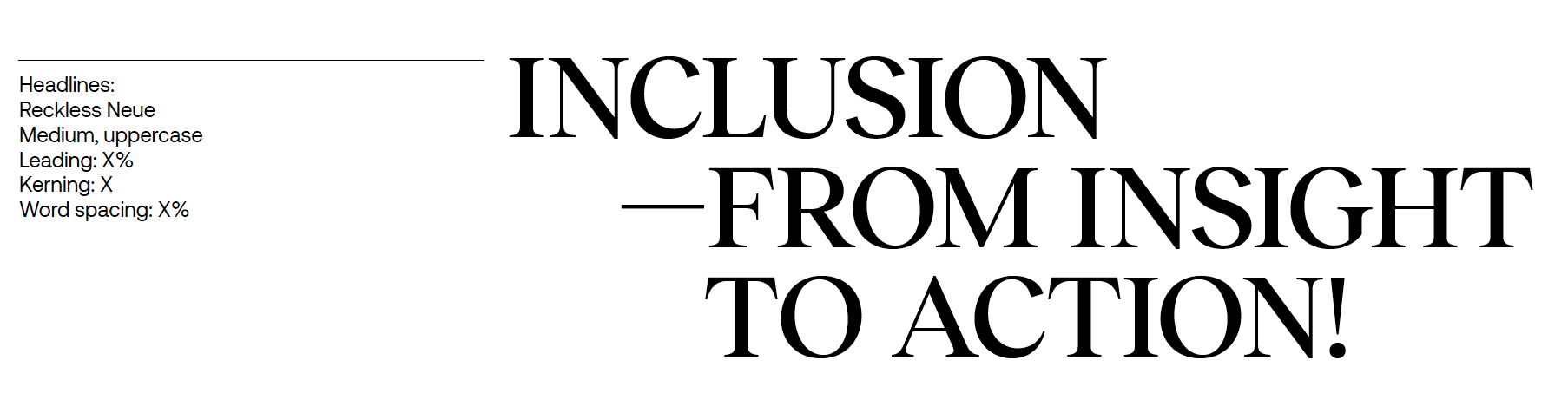
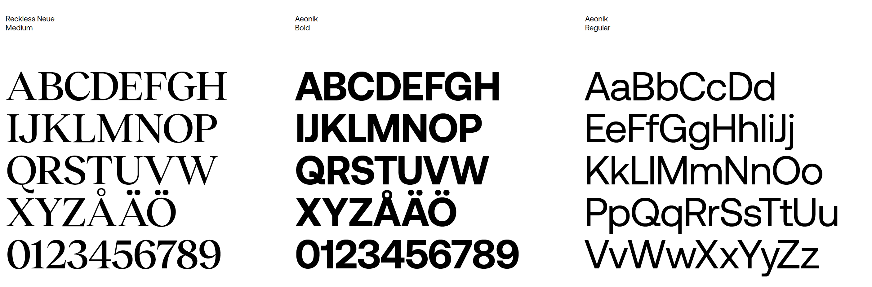
- Together, they create a modern dynamic with both tradition and innovation being contrasted, Christopher explains.
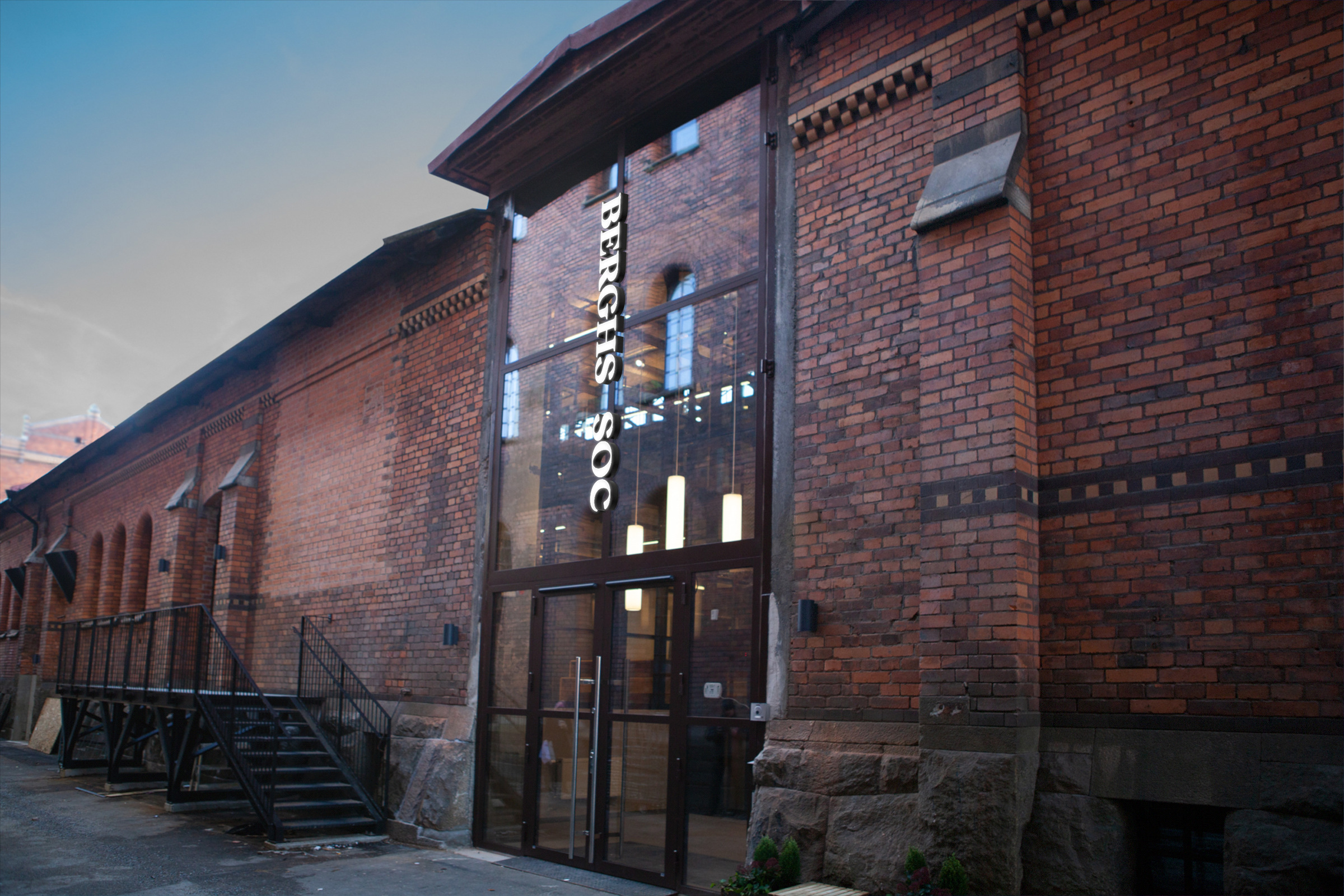
At the end of the year, we moved into our very own building in Stockholm’s up-and-coming neighborhood Norra Djurgårdsstaden, which further strengthens Berghs as a hub for communication.
- Despite the new home and renewed look, we still have the same soul and passion for communication! We are delighted with the end result and are in the middle of implementing and exploring our new brand expression," Christopher concludes.